
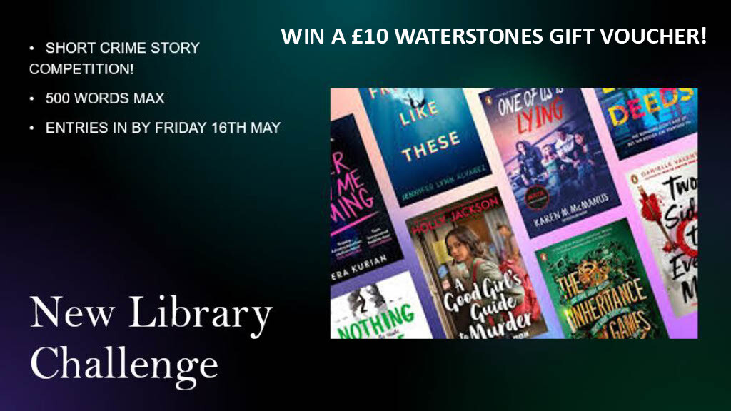
Library News!
Competitions and Awards
This term sees a new competition in the library - be sure not to miss out!
Results of Book Token Competition
The entries were judged by Miss McKenna.
All the entries have been sent to the National Book Token Competition https://www.worldbookday.com/competition/design-a-nbt/
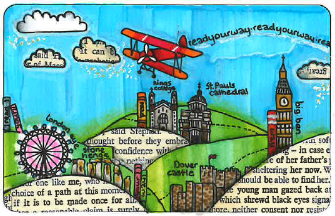
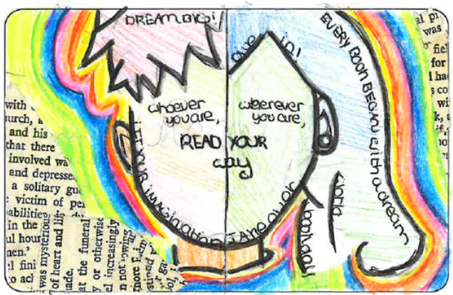
WINNER: Finley De Souza 7P-MT
Judges Comments: This design used symbolism really effectively to capture the central idea of 'read your way'. My interpretation was that the rainbow represented the diversity in our society and how everyone can find a way to love reading and books, as well as there being great books out there of every kind and for every person. These colours juxtaposed really nicely with the pages from a book, capturing perhaps the idea that simple black words printed on white paper can explode into all sorts of colours through the meaning and imagination of reading. The simple faces, split into two, but united with text crossing both shows how reading can create a private place for us to exist - in the pages of stories - as well as unite us in a common experience and shared passion.
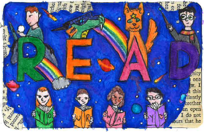
JOINT RUNNERS-UP: Isabella Mahoney 7P-MT & Georgie Van Overbeke
Judges comments (Isabella): This design showcased beautiful illustration where the range of colours effectively portrayed the idea of 'read your way', with a matching colour book and letter showing how everyone can find their 'perfect' read. Little details, like the books spelling out 'your way' were excellent touches that rewarded those who looked closely at the design. The large letters spelling 'Read' were the perfect, straight-forward instruction to anyone using a book token: read! And the characters behind the letters, suggests that behind these seemingly simple alphabet letters, and this simple act of reading, a wonderful world of fiction and discovery awaits. The deep and rich blue chosen reminded me of a galaxy, showing how reading can be like escaping into a new and rich world, and I loved the creative use of real book pages to create contrast and a frame around the main image.
Judges comments (Georgina): Wow! What a fantastic illustration - this design is really very impressive. The precision and small details create a whole world for the potential book customer to explore on the voucher, much like a book creates a whole world for the reader to immerse themselves in. The use of colour feels very sophisticated, with the blue sky fading subtly into the range of greens used for the hills. I like this subtle and nuanced blending as it reminds me of how literature can be very subtle in its own way. While all the landmarks are incredibly detailed, my favourite aspect is the joyfully bright plane which is sky-writing 'read your way', symbolising the exciting journey or 'flight' you go on through really good reading. It is showing what an adventure it is to read a book, and it does absolutely beautifully.